Interior Design Color Schemes: Create Your Dream Home with the Perfect Palette
Are you planning to redecorate your home? One of the most important aspects of interior design is choosing the right colour scheme. The colours you choose can set the mood of a room, reflect your personality, and create a cohesive look throughout your home. In this article, we will explore the basics of interior design colour schemes, and how you can use them to transform your living space.
First, we will take a look at the colour wheel and how it can be used to create colour schemes. We will explain the different types of colour schemes, such as monochromatic, complementary, and analogous, and how they can be used to create different moods. We will also provide examples of popular colour schemes used in interior design.
Next, we will discuss how to implement colour in your interior spaces. We will provide tips on how to choose the right colours for your walls, furniture, and accessories. We will also explain how to balance colours and create a cohesive look throughout your home. Whether you prefer bold, bright colours or soft, muted tones, we will provide inspiration and advice on how to create a beautiful and functional living space.
Key Takeaways
- Understanding the colour wheel and different types of colour schemes is essential for creating a cohesive look in your home.
- Choosing the right colours for your walls, furniture, and accessories can set the mood of a room and reflect your personality.
- Balancing colours and creating a cohesive look throughout your home is key to successful interior design.
Exploring the Colour Wheel and Schemes
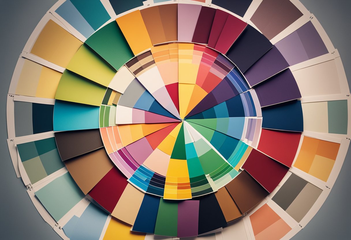
Are you looking to add some colour to your home but don’t know where to start? Understanding the colour wheel and colour schemes can help you create a cohesive and harmonious look for your space. In this section, we’ll explore the basics of the colour wheel and how to use it to select complementary colours and create a cohesive flow with colour schemes.
Understanding the Colour Wheel
The colour wheel is a visual representation of the relationships between colours. It is made up of primary colours (red, blue, and yellow), secondary colours (green, orange, and purple), and tertiary colours (yellow-green, yellow-orange, red-orange, red-purple, blue-purple, and blue-green). By understanding the colour wheel, you can select colours that complement each other and create a balanced look.
Selecting Complementary Colours
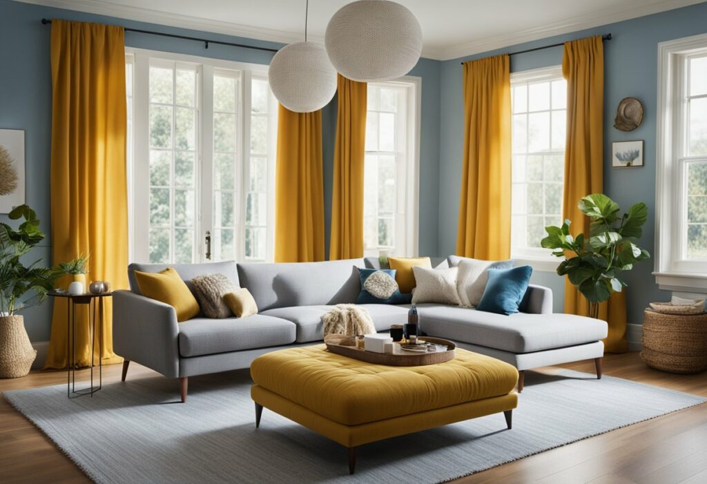
Complementary colours are colours that are opposite each other on the colour wheel. For example, red and green are complementary colours. Using complementary colours in your design can create a high-contrast look that is visually appealing. When selecting complementary colours, it’s important to consider the intensity of each colour. Using two highly saturated colours can be overwhelming, while using two softer shades can create a more subtle look.
Creating a Cohesive Flow with Colour Schemes
Colour schemes are combinations of colours that work well together. There are several types of colour schemes, including monochromatic, analogous, and complementary. Monochromatic colour schemes use variations of one colour to create a calming look, while analogous colour schemes use colours that are adjacent to each other on the colour wheel to create a harmonious effect. Complementary colour schemes, as mentioned earlier, use colours that are opposite each other on the colour wheel to create a high-contrast look.
When selecting a colour scheme, consider the mood you want to create in the room. Warm colours like red, orange, and yellow can create a cozy and inviting atmosphere, while cool colours like blue, green, and purple can create a calming and relaxing environment. By selecting a colour scheme that complements the mood you want to create, you can create a space that feels cohesive and harmonious.
In conclusion, understanding the colour wheel and colour schemes can help you create a visually appealing and harmonious space. By selecting complementary colours and creating a cohesive flow with colour schemes, you can add colour to your home in a way that feels intentional and balanced.
Implementing Colour in Interior Spaces
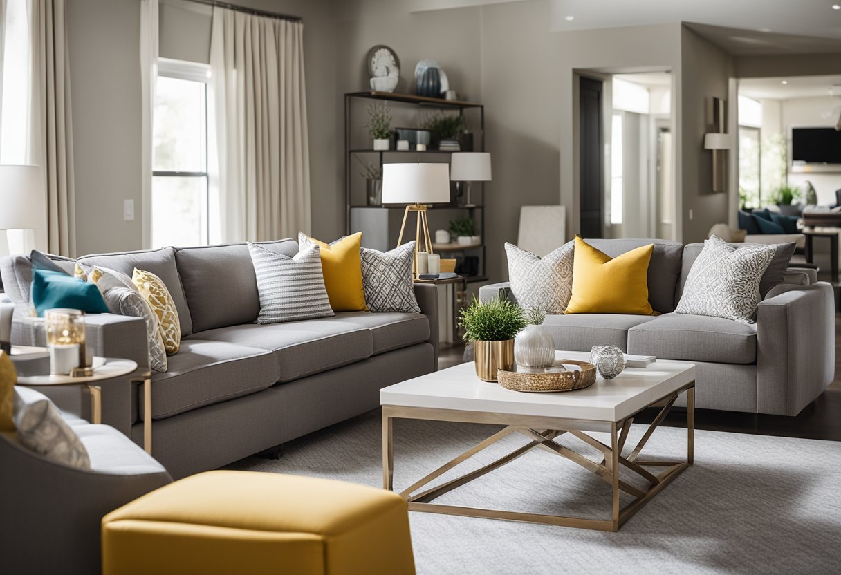
Adding colour to your interior space is a fun and exciting way to create a unique and personalised atmosphere. Whether you’re looking to create a bold statement or a calming retreat, there are many ways to incorporate colour into your home. Here are some tips on how to implement colour in your interior spaces.
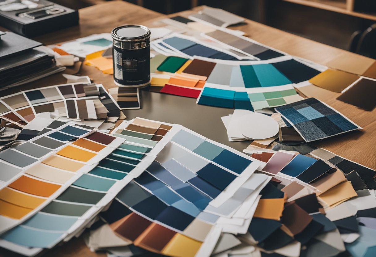
Choosing Paints and Wallpapers
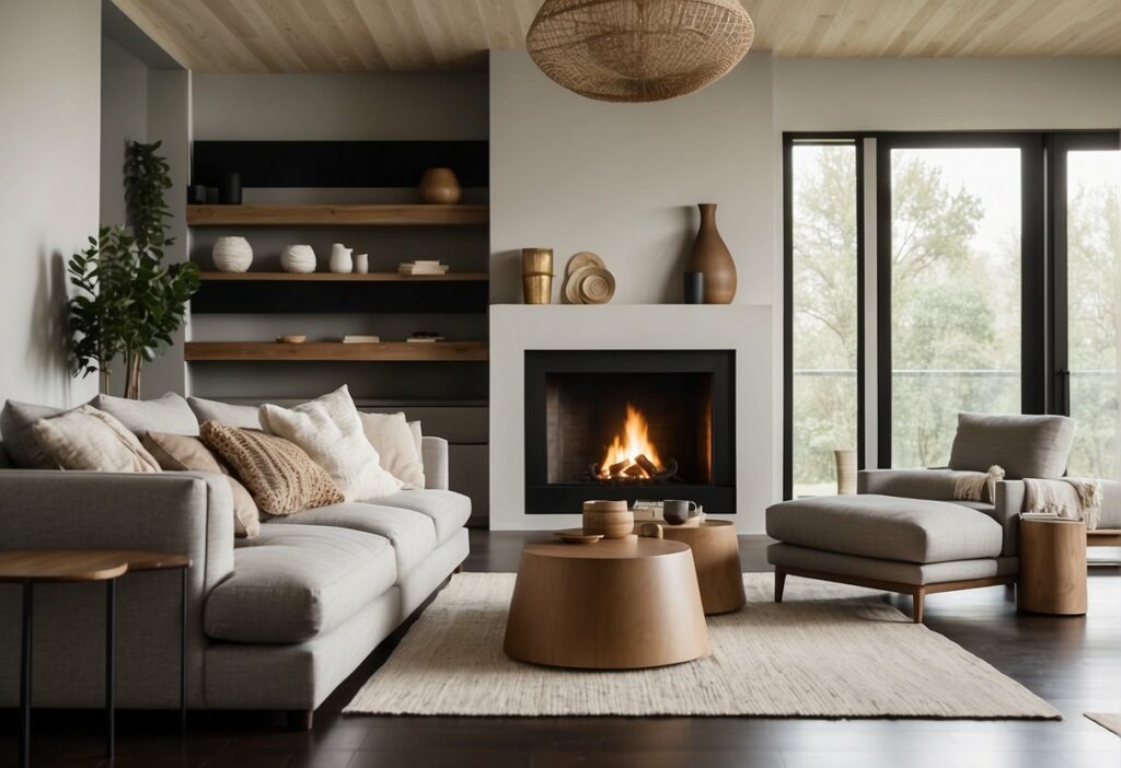
When it comes to adding colour to your walls, there are endless possibilities. You can choose from a wide range of paint colours or opt for wallpaper for a more textured look. Consider the mood you want to create in each room and choose colours that reflect that mood. For example, Benjamin Moore’s “Pale Oak” is a popular choice for creating a calming and serene atmosphere.
Incorporating Textiles and Accessories
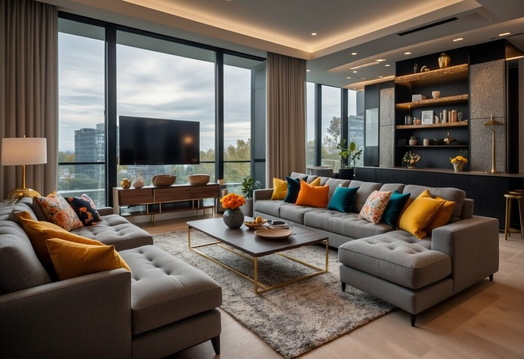
Adding textiles and accessories is a great way to introduce colour into your interior space without committing to a permanent change. You can add colourful pillows, rugs, curtains, and throws to your furniture to create a pop of colour. Consider incorporating accent colours that complement the wall colour or artwork in the room.
Balancing Light and Colour for Ambience
Lighting plays a crucial role in how colour is perceived in a room. Natural light can make colours appear brighter and more vibrant, while artificial light can create a warm and cosy atmosphere. Consider the amount of natural light in each room and choose paint colours and fabrics that work well with the available light. You can also add lamps and other light fixtures to create a specific ambience.
Incorporating colour into your interior space is a fun and creative way to personalise your home. Whether you choose to paint your walls, add colourful textiles, or play with lighting, there are endless possibilities to explore. By following these tips, you can create a space that reflects your unique style and personality.
Frequently Asked Questions
How can I select the perfect colour palette for my living room?
Selecting the perfect colour palette for your living room can be a daunting task. However, with a little bit of research and planning, you can easily create a beautiful and harmonious colour scheme. Start by considering the mood you want to create in your living room. Do you want a calming and relaxing space or a vibrant and energetic one? Once you have identified the mood, you can select the colours that will help you achieve it.
You can also take inspiration from nature, art, and fashion to help you choose a colour palette that you love. Additionally, you can use online tools and resources to help you visualise different colour combinations and see how they will look in your living room.
What are the most popular colour schemes used by interior designers today?
Interior designers today use a wide range of colour schemes to create beautiful and harmonious spaces. Some of the most popular colour schemes include monochromatic, complementary, analogous, and triadic. Monochromatic colour schemes involve using different shades and tints of the same colour. Complementary colour schemes involve using colours that are opposite each other on the colour wheel. Analogous colour schemes involve using colours that are next to each other on the colour wheel. Triadic colour schemes involve using three colours that are evenly spaced on the colour wheel.
Could you explain the three-colour rule in interior design?
The three-colour rule in interior design is a simple and effective way to create a harmonious colour scheme. The rule involves selecting three colours: a dominant colour, a secondary colour, and an accent colour. The dominant colour is the main colour in the room and should be used for the walls, floors, and large pieces of furniture. The secondary colour is used for smaller pieces of furniture and accessories. The accent colour is used sparingly to add pops of colour and visual interest.
What are the best colours to use for a modern house interior?
Modern house interiors often feature neutral colours such as white, grey, and beige. These colours create a clean and minimalist look that is popular in modern design. However, you can also use bold colours such as black, navy blue, and emerald green to create a dramatic and sophisticated look. Additionally, you can use metallic accents such as gold, silver, and copper to add a touch of glamour to your modern interior.
How do I choose a colour scheme that complements my home’s exterior?
When choosing a colour scheme that complements your home’s exterior, you should consider the style and architecture of your home. For example, if you have a traditional home, you may want to use classic colours such as white, cream, and beige. If you have a modern home, you may want to use bold colours such as black, grey, and red. Additionally, you should consider the colours of your surrounding landscape and neighbourhood to ensure that your colour scheme blends in well with the environment.
What are some exciting tips for creating a harmonious interior colour scheme?
Creating a harmonious interior colour scheme involves selecting colours that work well together and create a cohesive look. Here are some tips to help you create a harmonious colour scheme:
- Use the 60-30-10 rule: This rule involves using 60% of one colour, 30% of another colour, and 10% of an accent colour.
- Use colour psychology: Different colours can evoke different emotions and moods. Use colour psychology to select colours that create the mood you want in your space.
- Use texture: Texture can add depth and visual interest to your colour scheme. Use different textures such as velvet, wool, and linen to create a rich and layered look.
- Use lighting: Lighting can affect the way colours look in your space. Use different types of lighting such as natural light, ambient light, and accent light to create a dynamic and interesting colour scheme.